100+
Components with variations
How we scaled product delivery and consistency across learner-facing platforms
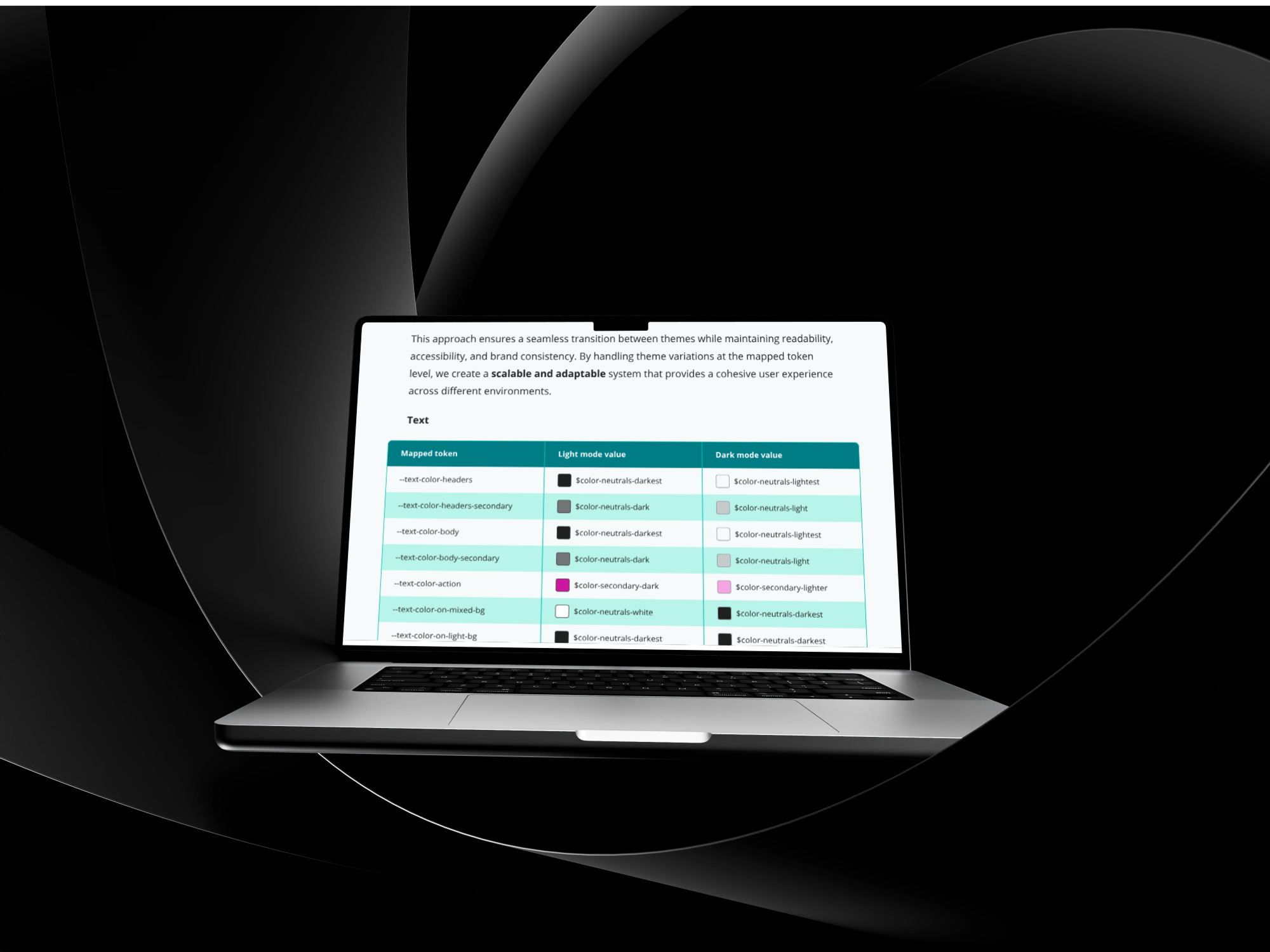
This project focused on creating a design system for the Direct to Learner department at Cambridge University Press & Assessment. At the start of the work, there was no shared system or single source of truth, and new products or experiences were designed from a blank canvas each time.
The design system established a consistent foundation for UI components, typography, colour, and spacing. It was designed to support internal teams as well as collaboration with external design and development partners, while aligning products with the latest brand guidelines and accessibility requirements.
Components with variations
Shared Storybook library
Design-Dev handoff time
Customer problem. Learner-facing products in the Direct to Learner department did not share a consistent design foundation. UI components differed between products, some were not aligned with the latest brand guidelines, and others used up to 17 different font sizes within a single page type. Colours and sizing were hardcoded, making consistency difficult to maintain across experiences.
Business problem. Designing new experiences or products required starting from a blank canvas due to the absence of a shared system or single source of truth. Mismatched UI components and lack of design foundations led to duplicated work and inconsistent implementation. Design feedback loops could take up to four months, particularly on projects involving external design resources. The lack of documentation or component guidelines made collaboration with external developers and design partners inefficient.
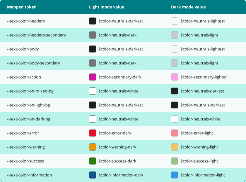
Define a common set of design foundations, including typography, colour, spacing, and layout principles, to replace ad-hoc and product-specific decisions.
Create reusable UI components to reduce duplication and provide a consistent starting point for new products and features.
Document components, usage rules, and design foundations to support internal teams and external partners working across multiple products.
Creating a single source of truth. A centralised design system was created to replace fragmented UI patterns and provide shared definitions for typography, colour, spacing, and components.
Supporting cross-team delivery. The system is used across all new products within the department, allowing designers , marketeers and developers to work from the same foundations and reference materials.
Replacing hardcoded design decisions. Hardcoded font sizes, colours, and sizing were replaced with system-defined tokens, making changes and maintenance more manageable across products.