6.8%
reduction in payment related support queries
Reducing payment friction for energy customers across PAYG and monthly plans
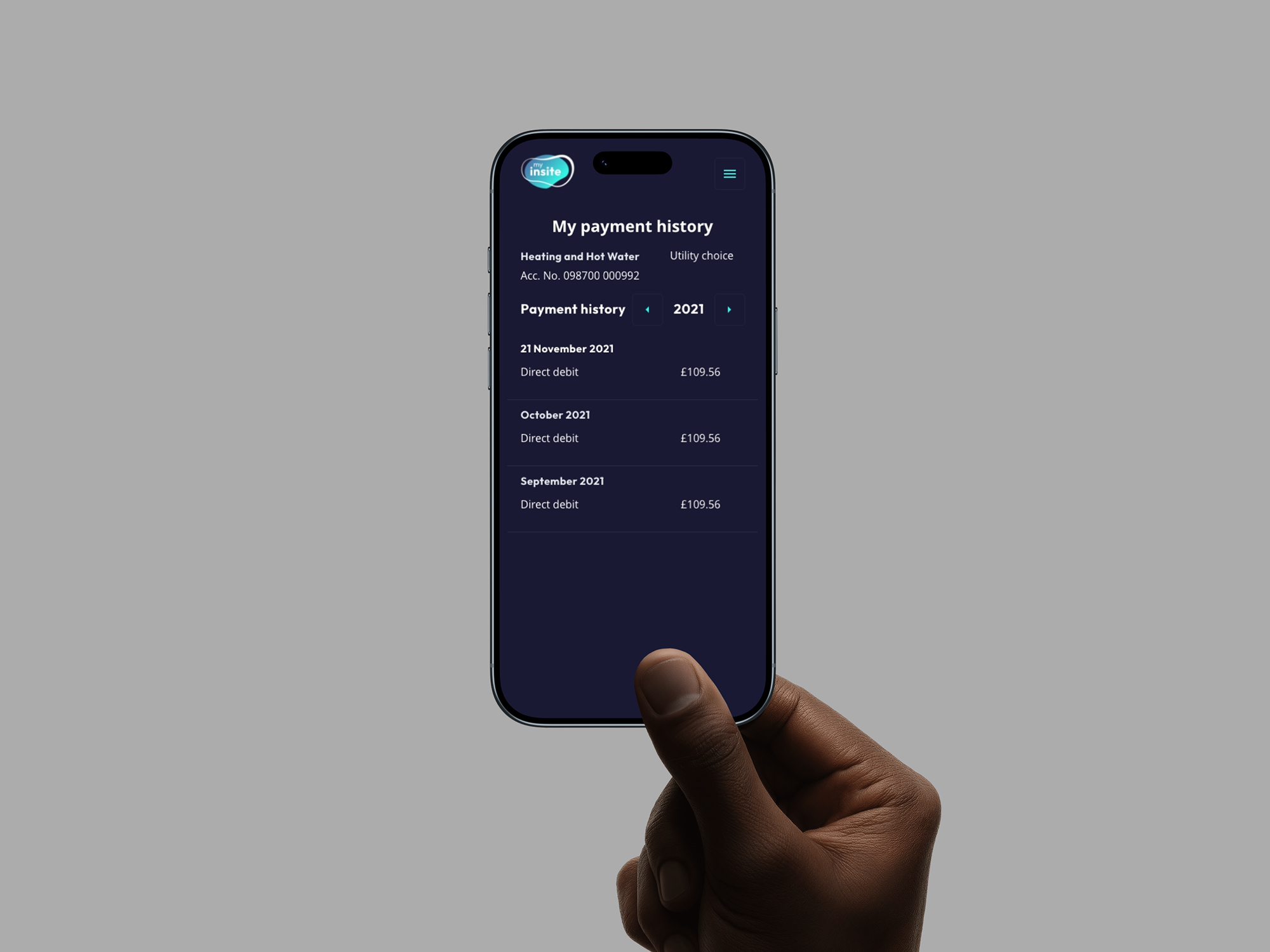
Insite Energy provides energy services for residential developments, supporting both Pay Monthly and Pay As You Go customers. The payment experience was a major source of confusion and customer support demand, particularly for users trying to understand balances, top-ups, and upcoming payments.
I led the redesign of the end‑to‑end payment experience, aligning it with a new brand system while simplifying core flows for clarity, confidence, and error prevention. The work reduced payment‑related customer service queries by 6.8% post‑launch, while creating a scalable foundation for future billing features.
reduction in payment related support queries
Colour themes delivered
Payment process for PAY and Monthly
Customer problem. Customers struggled to understand what they owed, when payments would be taken, and how top‑ups or balances worked. The experience felt stressful rather than reassuring, especially during time‑sensitive moments such as failed payments or low balances. Users needed clear, predictable payment flows that reduced anxiety and explained outcomes upfront.
Business problem. Payment confusion was driving avoidable customer service contacts and increasing operational costs. Insite Energy needed a clearer, more self‑serve payment experience that reduced support demand, improved trust, and scaled across different billing models without increasing complexity.

Prioritise what customers need right now over exposing all billing data at once.
Reveal complexity only when necessary, especially around balances, breakdowns, and payment history.
Use shared patterns and language so Pay Monthly and PAYG users feel part of one coherent system.
Simplifying payment flows. Payment journeys were redesigned to focus on a single primary action per screen, with clear confirmation states and next steps. Error handling and edge cases were rewritten to explain what happened and what users could do next.
Designing for reassurance. Balance displays, payment confirmations, and upcoming charges were reframed using plain language and visual hierarchy. This reduced cognitive load during high‑stress moments and helped users feel in control rather than uncertain.
System‑led consistency. A shared set of components and patterns was introduced across Pay Monthly and PAYG experiences. This reduced design drift, improved learnability, and made future billing features easier to design and ship.